Lily Bailey
A brand that feels like a memory
Every designer knows the saying about the cobbler's children going barefoot. For years I gave my clients everything I had, and my own brand got whatever was left. There was always a reason to wait: no time, other priorities, a logo from my school days that was "good enough for now".
This is the story of finally taking my own advice and giving my brand the same process I give every client.
The challenge
Look at a hundred brand designer portfolios and you'll see the same thing: black and white, clean grids, quiet sans serifs. It's safe and tidy, and it makes everyone impossible to tell apart. That is exactly the sameness I help my clients step out of, so a brand that blended in would have contradicted everything I say.
A few years ago the idea for a new brand and a first version of the logo finally arrived. The website I imagined, though, felt too big for me, and building it the usual way would have cost a small fortune. So it stayed a sketch.
Finding the position
I tested many directions, and each time I came back to two conditions. The brand had to have real room in the market, with something people warm to. And it had to come from me, because a personal brand only works when the person behind it is comfortable living in it every day.
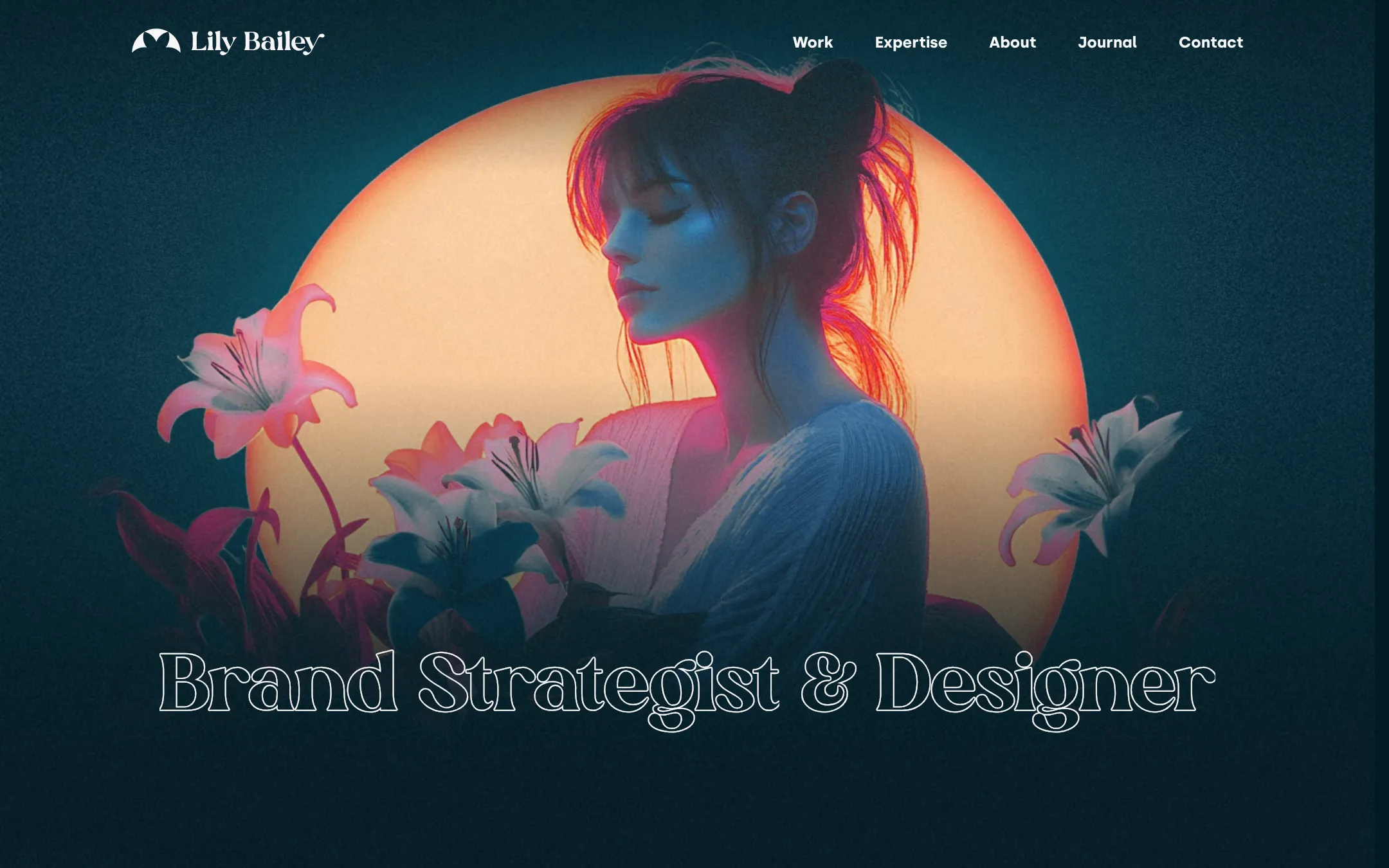
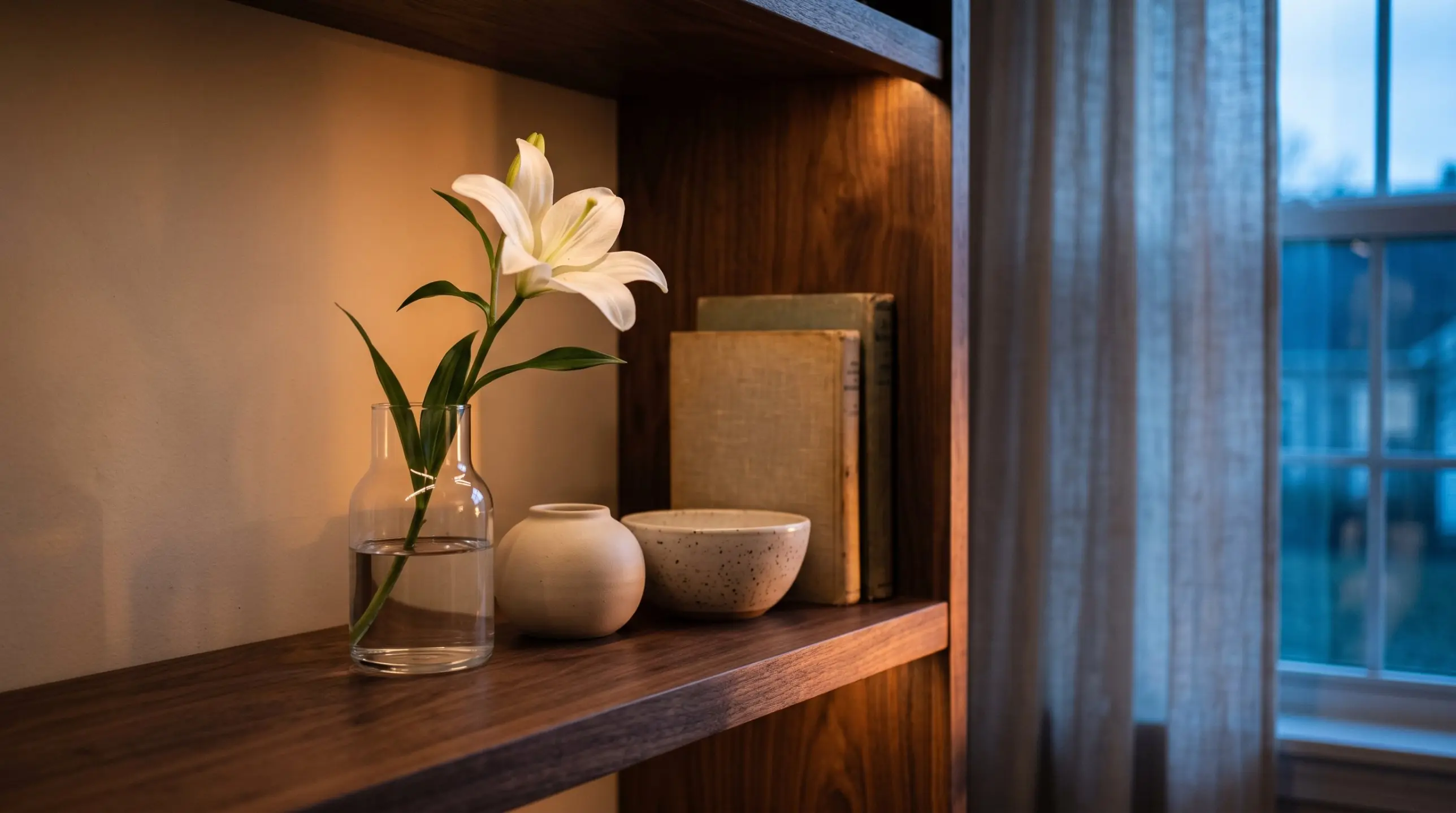
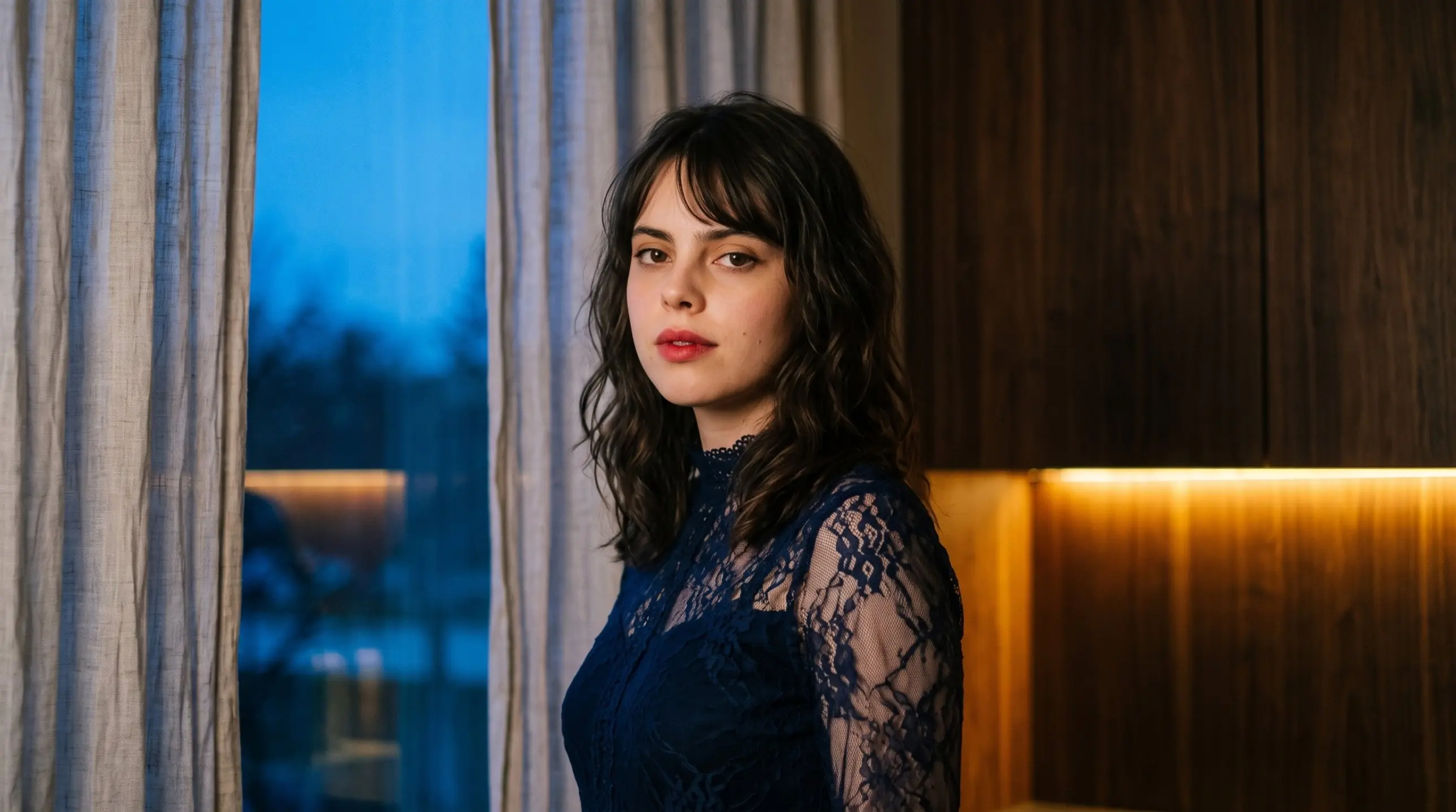
The answer was nostalgia, but a particular kind. Most nostalgia lives in daylight: sunlit afternoons and faded summers, the soft haze of games like Life is Strange. Euphoria showed me the other side, a night nostalgia of blue hour, glowing light and cinematic colour that feels completely modern. I fell in love with it, and in my part of the market nobody owned it.
Choosing it was the hard part. Saying "I'll be the cinematic, poetic one" in a sea of monochrome websites takes courage, especially when the decision lives only in your own head. Positioning gave it a backbone: a brand strategist and designer for established companies that have outgrown their look and aren't afraid to step out of the crowd.

What changed
For the first time, my brand matches my work. Modern technologies let me design and build the website myself in custom code, so the site that once felt out of reach is now fully mine, down to where it lives. Every rule, from the brand codes to the tone of voice, sits in an interactive web brand manual, the same kind I build for clients.
The website, the manual, my social profiles and the way I show up at events now tell one story. If you've scrolled this far, you've already seen the result. You're standing in it.