Terra Mater
Cultivating the landscape of the soul
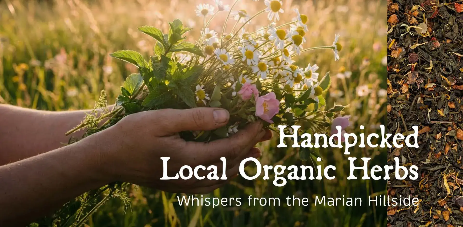
Terra Mater is more than a line of organic products; it is a mission of inner balance born in the northern borderlands. Founded by a practising psychotherapist, the brand turns locally grown herbs into healing teas, syrups and treats.
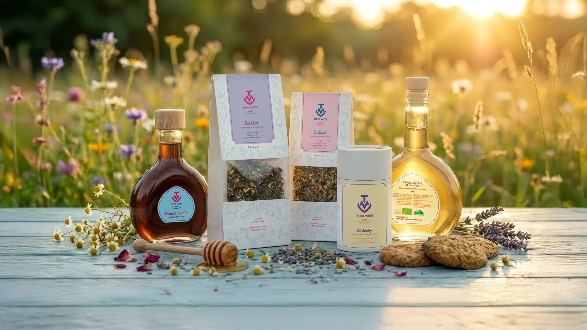
My role was to capture the raw beauty of the Marian Garden landscape and translate the founder's healing touch into a packaging system that feels as grounded and nurturing as the products themselves.
The challenge
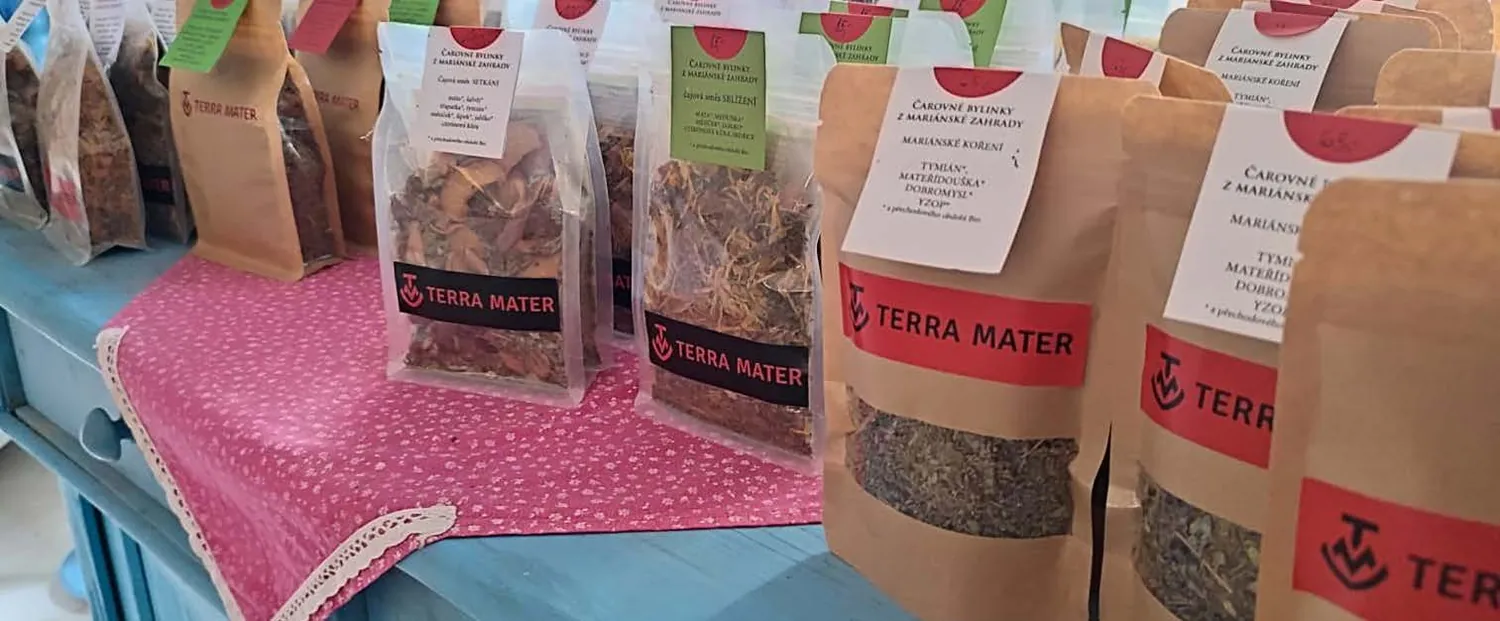
The herbal blends were of exceptional quality, but the brand suffered from a visual disconnect. The original presentation was trapped in a provisional, slightly "witchy" DIY aesthetic that clashed with the founder's warm, professional persona. The homemade look lowered the perceived value on the shelf and made a premium price hard to justify.
The task was to professionalise the brand by translating the client's vision of Baroque beauty into a sophisticated design system that invites trust and supports higher margins, without losing the project's authentic soul.
Creative approach & thinking
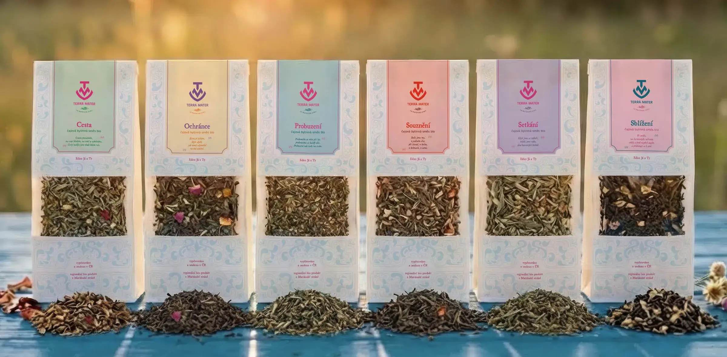
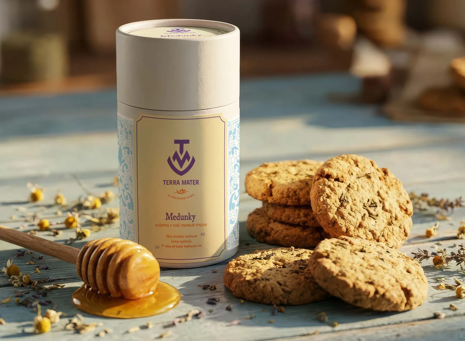
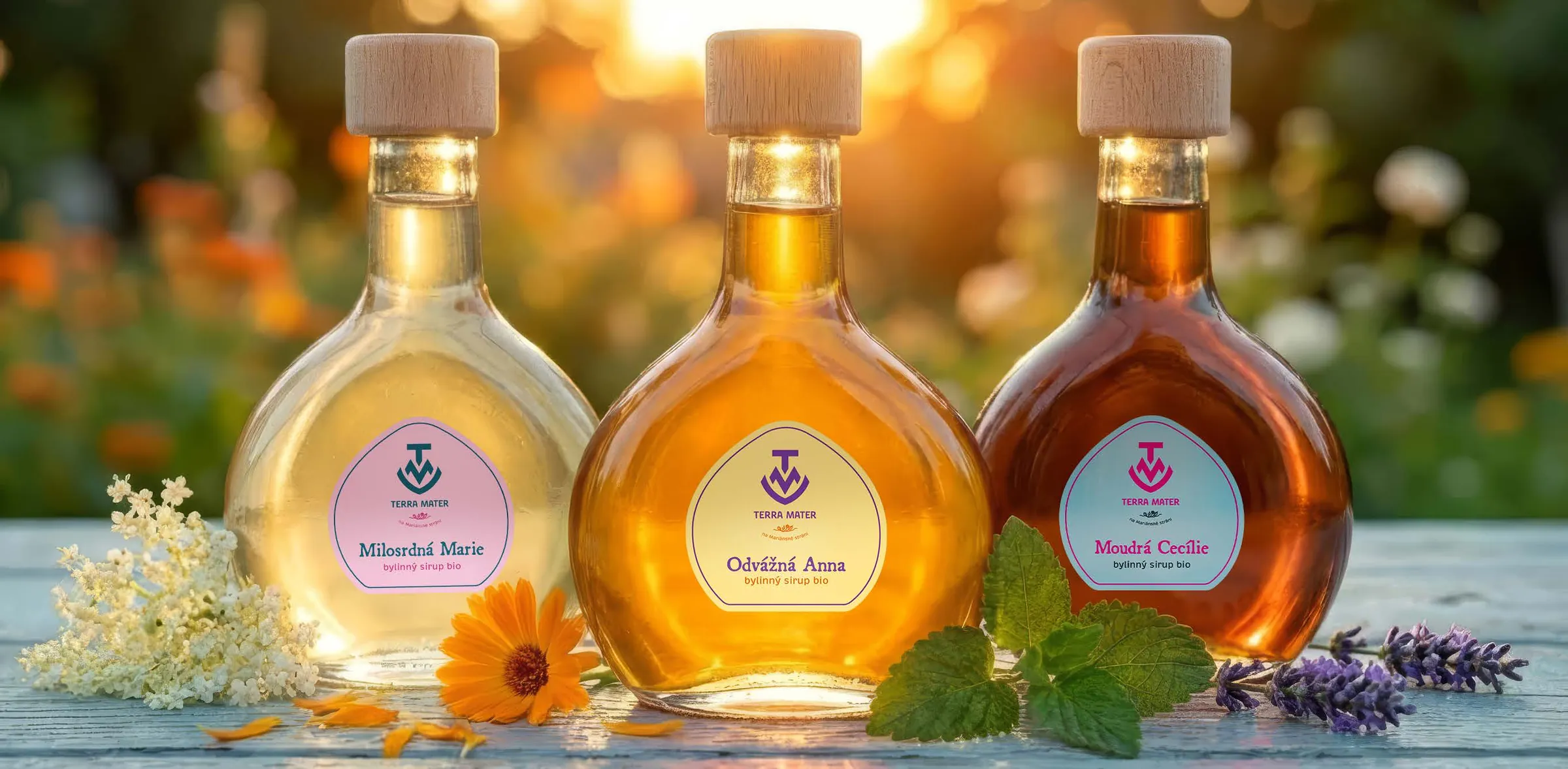
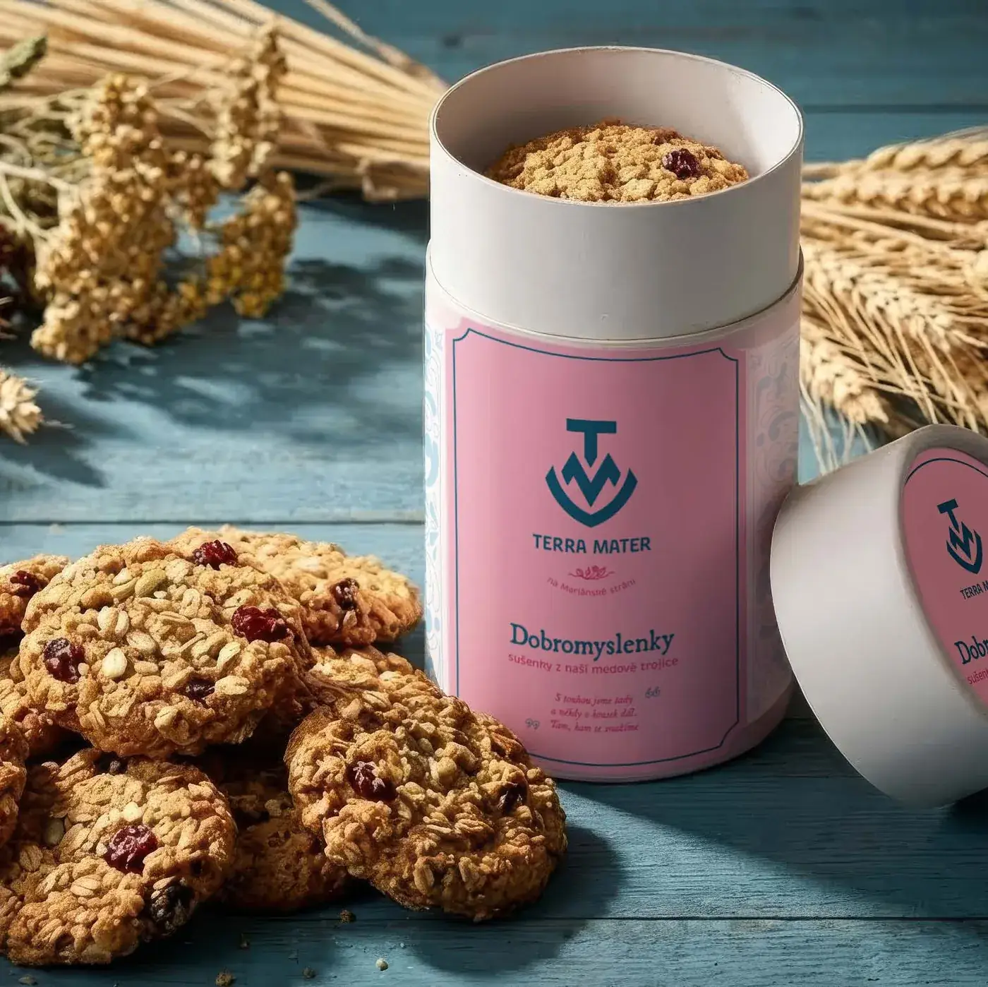
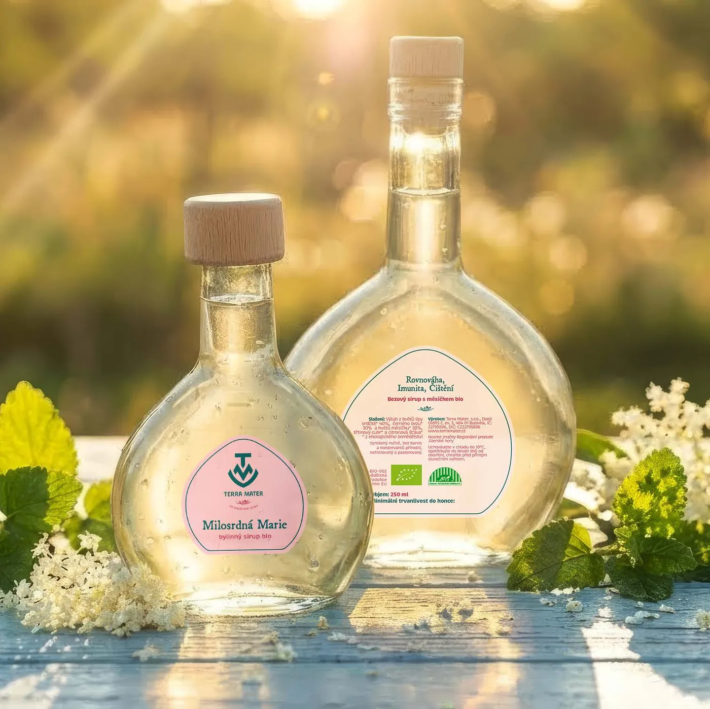
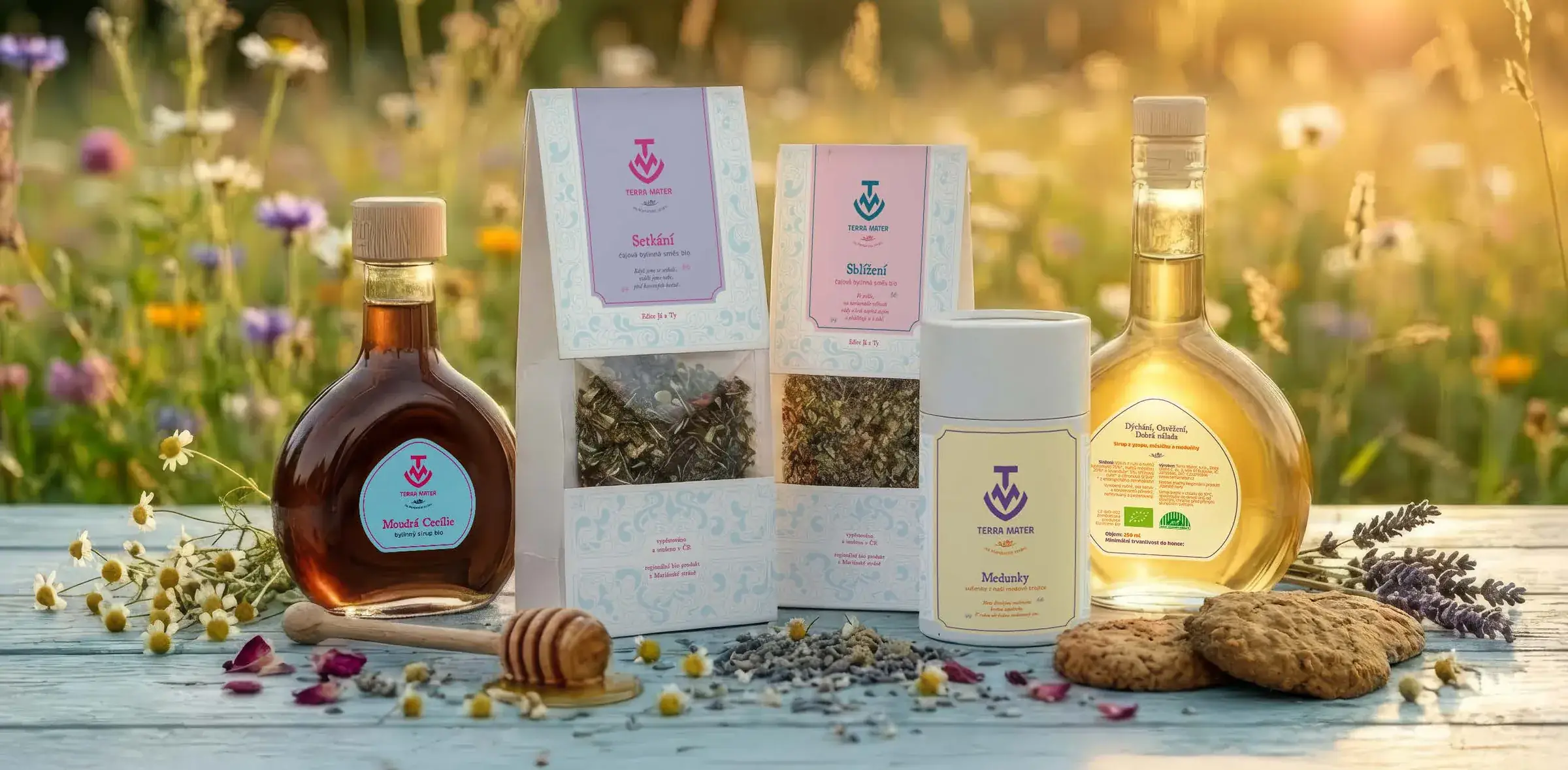
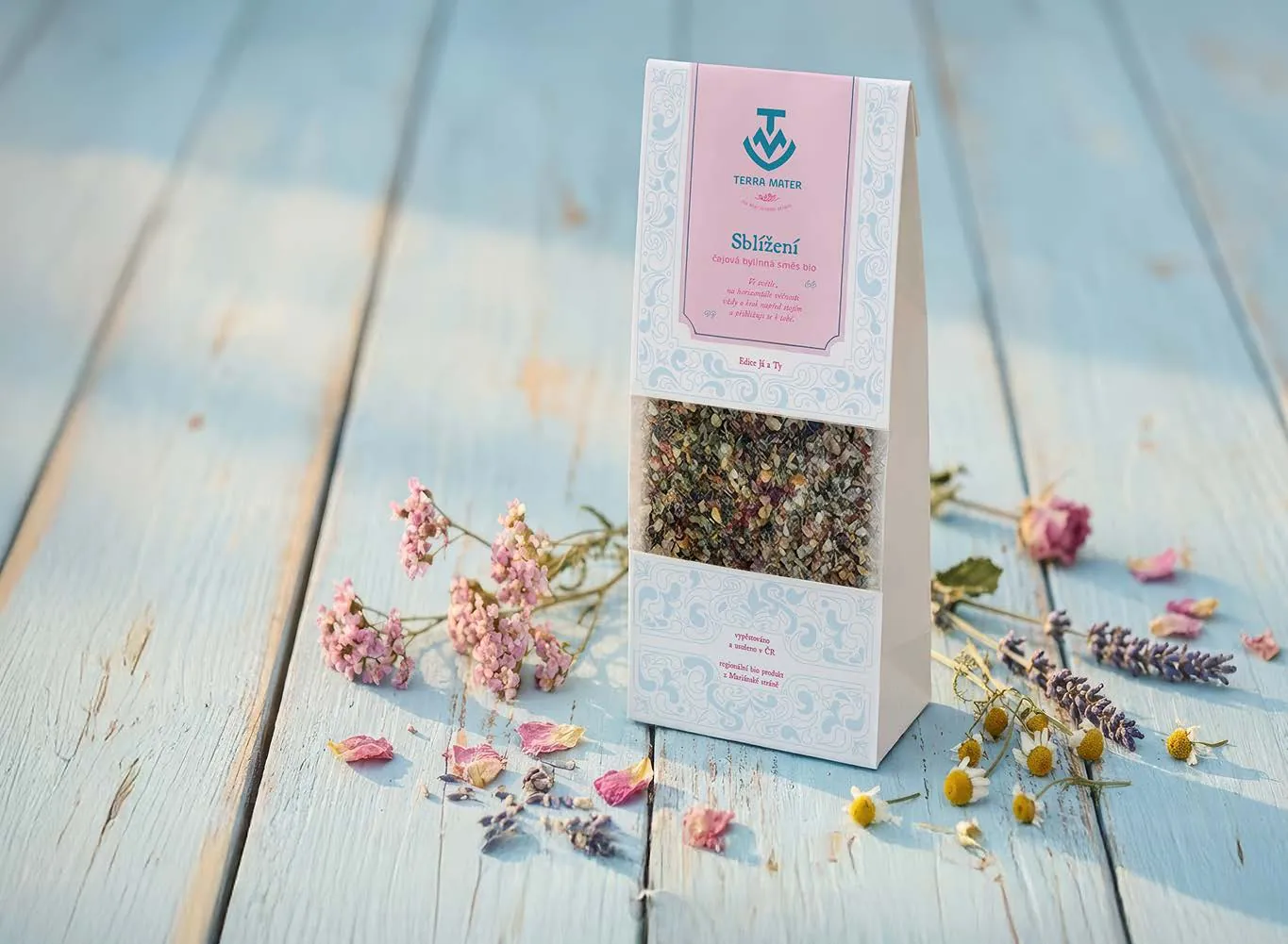
I embraced the client's vision of a Baroque aesthetic, moving away from minimalism to rich yet delicate ornamentation. The visual system uses intricate full-wrap patterns and a soft pastel palette to tell product categories apart.
Reflecting the founder's background in psychotherapy, the design is crafted to calm the mind, so the visual experience soothes the soul just as the organic content heals the body.